Frequently Asked Questions
What does this setting do?
I have added many options that add a lot of flexibility, but that high number
of options can be also confusing, so I'll try to make a bit clearer what is the function of each of them:
Time Line:
You can select any time interval using 2 buttons of the mouse, left click for moving the first date and last date in the interval and center click (wheel) for moving the whole interval around preserving its lenght.
Appearance:
The colors are used in the following order:
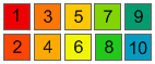
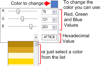
If you want to change a color, left click it and modify it using the options in the box that appears.
More about how they are applied to the graph in the 'Date Based Colorization' section.
Average:
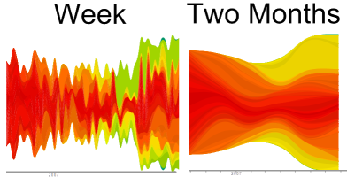
It's the interval of time that will be used to average the play counts when calculating a graph, it allows you to view trends in different levels of detail, select 'week' for the highest detail and month and above for more global trends.
Mode:
It simply allows you to select to graph artist, albums,tracks or tags. The graphs tag calculation may take very long time due to the high amount of data that is necessary to download from last.fm
Items:
Overall Top:
The graph will be made using ONLY the top 'X' items (artist, albums,tracks or tags) from the selected date interval.
Interval Top:
The graph will be made using ONLY the top 'Y' items from each interval. for example if you select 'Month' in the average option and select a date interval of one year, there will be 12 intervals, the program will check each of them to find their top 'Y' artists and the final list with all the top 'Y' from each interval will be used in the graph.
Custom:
Only the items in the list will be used in the graph, you can add,remove and clear them by right clicking the list and selecting the appropriate command. (TIP: If you are making a graph of albums or tracks you can add all the albums or tracks from an artist at once by adding to the list the artist name)
Settings:
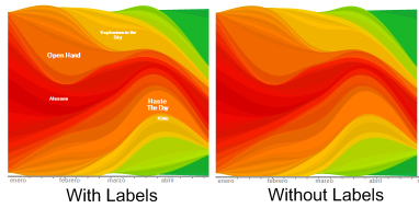
Labels:
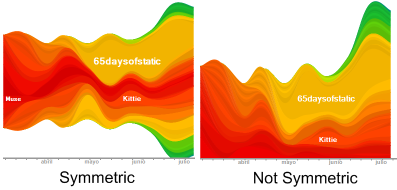
Symmetric:
Date Based Colorization:
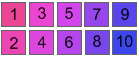
If checked, the color of the waves will be calculated taking into account the time that the item (artist, album, track, tag) first appeared in the graph.
If it appears close to the first date in the range, it will have one of the first colors in the list (1,2 or 3)
and if it first appears late towards the end of the interval it will have one of the last colors
in the list (8,9, or 10). If this option is unchecked the colors will be assigned to the waves from
bottom to top using the following scheme 1-2-3-4-5-6-7-8-9-10-9-8-7-6-5-4-3-2-1-2-3 -- ...(where each number represent the corresponding color).
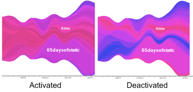
Random Positions:
If checked the waves will be added in random order otherwise the newer items will flow in the border of the graph.
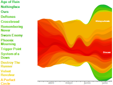
Legend:
If checked the list of the items in the graph will appear in the left side of the graph.
H. Zoom and V. Zoom:
They control the horizontal and vertical size of the graph
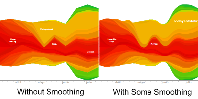
Smoothing:
Controls the smoothing of the vertices in the graph.
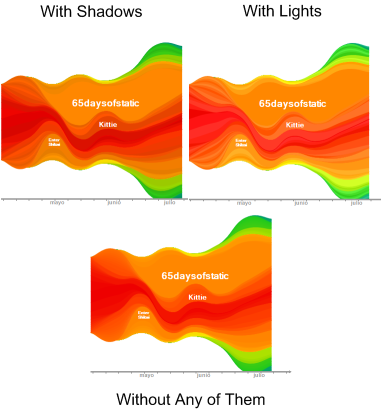
Lights/Shadows:
They are used to allow you differentiate from items with very similar color that are next to each other, besides they also make it look much better :), you can add lights moving the slider to the left or shadows moving it to the right.
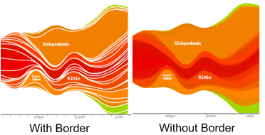
Border:
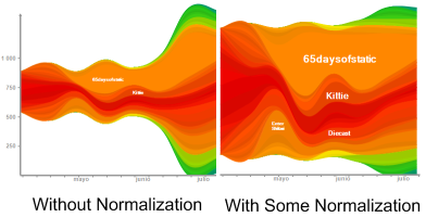
Normalization:
The normalization slider allows you to specify the sensibility of the width of the graph to amount of tracks played in each interval.
How do I save and load a stat setting?
So you have spent a lot of time playing with the settings and you have found a combination of them that makes your wave graph shine, you don't need to lose all that work, just click 'Save stat settings', click 'Save Stat View' add a name to the file and save it.
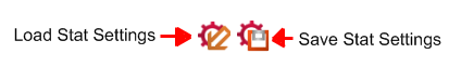
To load it just click 'Load Stat Settings' button and open it.(TIP: when you click 'Load Stat Settings' you can find a folder named 'Wave Graph Color Themes' , inside it you can find some color schemes for your graphs)
How are the chart changes compared in chart mode?
If you select for example a period of time of three months, it calculates the changes using a chart for a time interval finalizing in the first date of the selected range and starting three months before.